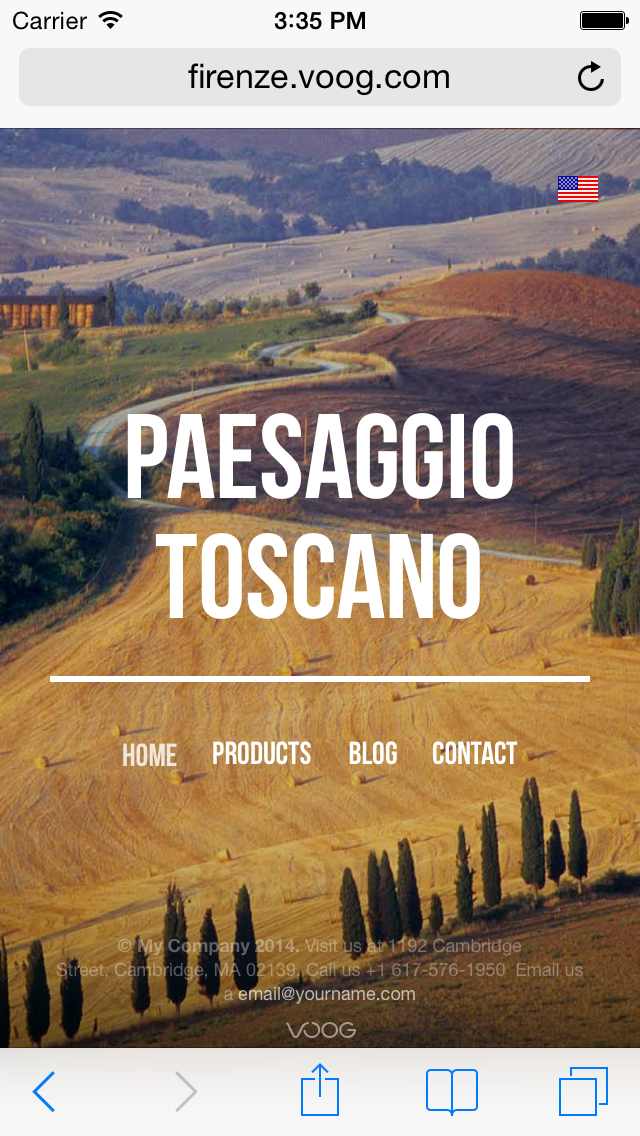
As more and more browsing is done with smartphones and tablets, we know your website has to look great on all devices. This means that all of our design templates look good on screens of different sizes and are made responsive by default.
Therefore you don't have to create several designs for multiple screens, and you can focus on creating the content on your website.
Still, keep in mind that if you decide to alter the design with the design editor, we do not guarantee that your design will be perfect on every screen and you do have to test it on your own.

