Clear landing pages create a more focused user experience and, when designed correctly, become extremely powerful lead-generation tools.
Let’s take a closer look at the eleven landing page best practices that will help you reach your business goals.
Whether it’s getting more sales, sign-ups, or simply growing your subscriber lists, these tips apply to all types of landing pages.
Landing page basics
Landing pages are specialized web pages crafted with a distinct purpose, often associated with specific user actions. Their primary goal is to guide visitors toward a particular action.
With a 160% higher conversion rate on average, landing pages outshine alternative signup forms like the interactive Wheel of Fortune (10%), pop-ups (3%), and sign-up boxes (2%).
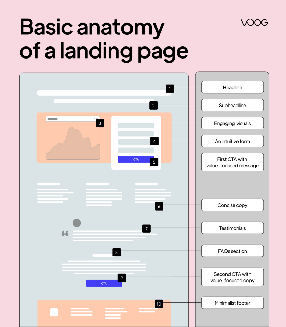
Creating a good landing page requires a combination of elements that grab and keep users' attention. Although each landing page is unique, most high-converting pages follow a logical structure. Use the cheat sheet below and follow our landing page best practices to maximize your results.
Best practices for landing pages
Eleven landing page best practices may seem like a lot, but most are easy to implement and can make a big difference in your conversions. We break down each of the tips below.
1. Craft a compelling headline
Every great landing page needs an awesome offer that visitors will understand within seconds. Write your headline in a way that will grab their attention, and use the subheadline to communicate your offer clearly and concisely.
If you're launching a new service, product, or business, defining your unique selling point and value proposition during the go-to-market stage is crucial. These should align with your brand's core message.
Alternatively, a landing page created for a specific campaign (e.g., seasonal offers) should also have a clearly defined offer. This will make it easier for you to write focused copy.
Here are a few things that have helped me come up with impactful copy for landing page hero sections:
- Clearly articulate your value proposition using the KISS method.
- Use specific prompts for ChatGPT based on messaging, psychology, or marketing frameworks to generate raw ideas.
- Use tools like Copy.AI to create headline variations quickly.
- Research your competitors' messaging.
- Test your landing page messaging with Wynter.
- Make sure the copy of your headline and subheadline matches the copy in your ads and marketing campaigns.
- Use persuasive language to convey a sense of exclusivity or limited availability.
Making the first interaction memorable requires a thoughtful approach to language, clarity, and alignment with user expectations.
2. Strategically place CTA buttons
Call-to-actions (CTAs), strategically positioned throughout the landing page, direct users seamlessly through the conversion journey. CTAs should be persuasive, encouraging visitors to move to the next step.
Here are a few tips to help you create effective CTAs:
- Speak directly to the user. Write CTAs in the first person to create a sense of direct communication.
- Highlight user benefits. Focus on what the user gains by taking the desired action.
- Optimize button text. Make sure the CTA button text is clear and action-oriented. Use verbs that prompt action (e.g., "Get," "Start," "Free trial," "Try").
- Consider the psychological associations of colors. For example, red can convey urgency or importance, while blue might evoke trust and calmness. Choose colors that align with the emotional response you want to trigger.
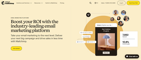
Mailchimp's landing page deserves recognition for its strategic placement of the call-to-action button.
3. Use visuals that illustrate your offer
A well-chosen visual can convey emotions, tell a story, and guide users through the content of your landing page. Dive into your brand's color palette and narrative. Ensure it mirrors your mission and identity.
Here are four practical ideas to make the most of visuals on your landing pages.
- Use unique images that resonate with your brand.
- Create illustrations that tell your brand story or showcase your product.
- Experiment with interactive visuals or gifs to engage users.
- Showcase customer testimonials in the hero section to add social proof and humanize your brand. At Voog, we love sharing our customers' success.
Take inspiration from Wix, who transformed their landing page into a creative space with a captivating digital illustration. The design emphasizes key points, such as the mountain's peak guiding visitors to the main action.
Image source: Wix.com
4. Tell a story with videos
A great landing page video enriches the user experience and effectively conveys complex messages in an easily digestible format. While not always necessary, strategically incorporating a well-produced video can increase conversion rates by up to 80%.
That's because videos are much easier to process than texts. You can use anything from explainer, promo, demo, or testimonial video. No matter the choice, make sure your videos lead with your value proposition and provide value or additional context for the user.
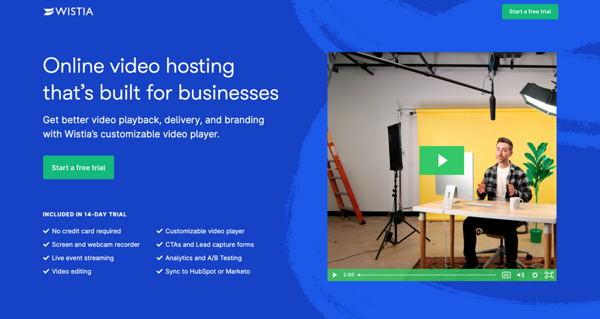
Wistia's video landing page is an excellent example of crafting impactful landing pages and demonstrating value through the product. The video showcased prominently immediately captures attention.
5. Write persuasive copy
When the landing page copy resonates with your audience, it captures their attention instantly. Your copy should be compelling, informational, trustworthy, and effective.
Short and impactful sentences make the landing page attractive, keeping visitors engaged and guiding them toward the action you want them to complete. Well-crafted landing page copy should always address customer pain points and proactively respond to their objections.
Here are a few tips that will help you create better landing page copy:
- Understand your target audience's needs, preferences, and pain points.
- Highlight the benefits of your product or service rather than just listing features.
- Use impactful and emotional words that evoke a response. Words like "exclusive," "effortless," or "transform" can make your copy more compelling.
- Encourage action by creating a sense of urgency. Limited-time offers, exclusive deals, or countdowns can prompt visitors to take immediate action.
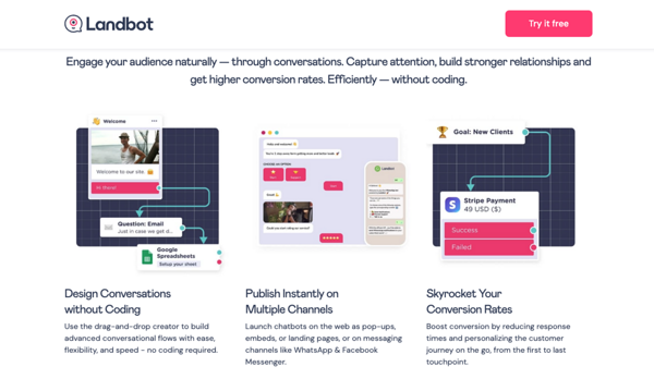
Landbot is an excellent example of a landing page best practices. It effectively showcases the benefits of its automated conversations feature.
Image source: Landbot.io
6. Reduce form fields
Many landing pages capture intent through forms. These forms should, ideally, be placed above the fold to make them more easily accessible. Another way to improve the landing page conversion rate is by minimizing unnecessary fields. This removes barriers, encouraging users to complete your desired action.
Here are a few landing page tips for efficient form design:
- Condense form fields to essential information to minimize user effort.
- A/B test different form fields to see which performs better.
- Reduce user hesitation by avoiding unnecessary steps.
- Consider capturing self-attribution data with your forms.
- If using multi-step forms, provide clear indicators of progress.
- Implement autofill and smart features to enhance user convenience.
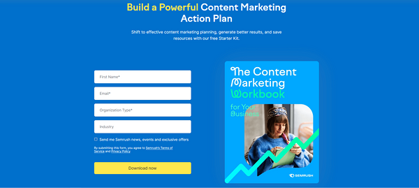
Semrush's landing page exemplifies this concept, featuring a simple, streamlined form that encourages users to download their report while collecting essential information such as email addresses, industry, and organization. This information enables sales teams to reach out to individuals or to create cold emails for targeted email marketing campaigns.
7. Use consistent branding & messaging
Aligning your landing page content with your overall brand identity ensures a seamless and recognizable experience for visitors.
Users' familiarity with visuals, language, and design elements reinforces their confidence in your brand. This coherence builds trust, signaling that the landing page is an authentic extension of your brand.
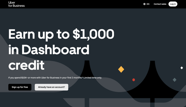
Uber maintains consistent branding elements across its landing pages, reinforcing a cohesive and recognizable brand identity.
8. Build trust with social proof
No marketing strategy can beat word-of-mouth. Testimonials and case studies highlight a track record of delivering value to real people. By featuring authentic narratives on your landing page, you assure your audience that your product or service consistently meets customer expectations.
Social proof and FOMO are powerful psychological tactics that make customers feel confident with their decision.
Keep in mind the following suggestions for establishing trust through social proof on landing pages:
- Mention your customer base size. Example: "Trusted by over 50,000 customers worldwide."
- Display testimonials creatively on your landing page.
- Showcase endorsements from industry leaders or partners.
- Highlight positive review ratings from third-party sites.
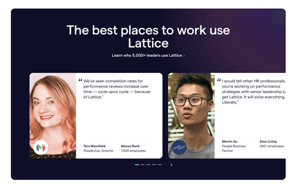
Lattice, a prominent HR management platform, effectively leverages its testimonial section to showcase tangible outcomes for its customers.
Image Source: Lattice
9. Don’t forget the mobile experience
One of the most critical landing page best practices is always designing for mobile. Most marketers develop beautiful desktop landing pages but completely forget about the mobile experience.
Our world is mobile-first, so the landing pages we create should reflect this. Here are a few tips to help you create better mobile experiences for your landing pages:
- Make sure elements load quickly and that there is no displacement. You can check this with Google’s Lighthouse or Page Speed Insights.
- Make elements like buttons, forms, and images readily accessible and visually appealing on mobile devices.
- Optimize images for mobile responsiveness, page speed, and accessibility.
- Arrange content blocks in a logical order.
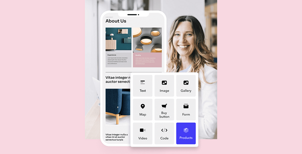
All websites built with Voog are responsive and mobile-friendly. Designed for flexibility, our pages easily adjust to diverse screen sizes, offering a user-friendly smartphone and tablet experience.
Also, building mobile-responsive sites has become more accessible with our visual builder. With intuitive design tools and templates, Voog allows users to build landing pages that match your brand and function flawlessly on any device.
10. Remove unnecessary navigation
Eliminating distractions is critical for a high-converting landing page. Users with a clear path and no navigation clutter are likely to stay focused on the primary goal of your page, which is to convert them into leads.
Anything that competes with your CTAs should be stripped from the page unless it's a secondary objective or essential navigation.
Here are a few tips to point users toward a desired action:
- Remove any unnecessary links from your copy or navigation.
- Keep the focus on your direct CTA and repeat it after each content block.
- Streamline the visual layout by removing distracting menu options.
- Use arrows or directional queues to draw attention to your forms.
11. Deliver on your promised offer with thank you pages
"Thank you" pages show appreciation for a completed action and guide users to their next step. This is the time to provide additional links to your pages and deliver on your offer.
You can design this type of page for various actions, including:
- Joining your email list;
- Downloading an ebook;
- Registering for a webinar.
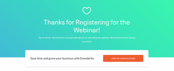
Eventbrite's thank you page expressed gratitude to people who have joined their webinar. It uses a simple explanation to let users know what to expect next. The button immediately prompts new subscribers to watch a video, attracting those interested in their product.
Three successful landing pages from real-world examples
This section shares a few more examples that follow landing page best practices. Each example has screenshots showing the strategic elements, interesting content, and smooth design that make them effective.
1. Webflow
Webflow, a design tool tailored for web developers, efficiently conveys information through interactive illustrations. The animation on the home page reacts to the user and allows them to witness the product without scrolling.
What can you learn from this landing page:
- Design the landing page to facilitate a seamless sign-up process.
- Highlight free features or services prominently on the landing page.
- Incorporate animated visuals or demonstrations to showcase your product's value.
2. Shopify
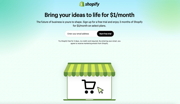
Shopify's trial page is not the prettiest in the world, but it is recognizable and delivers value. The page avoids excessive text, yet effectively convinces users with an excellent value proposition.
What can you learn from this landing page:
- Keep your landing page straightforward, avoiding unnecessary complexities.
- Craft headlines and content with the user in mind.
- Ensure your messaging aligns with the unique aspects of the user's journey.
3. Adobe Experience Cloud
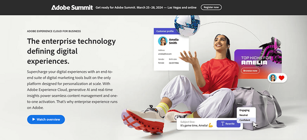
Adobe Experience Cloud's landing page leverages visually stunning and professionally produced video content. The messaging is concise, clear, and focused on communicating the value prop.
What can you learn from this landing page:
- Invest in visually stunning and professionally produced video content.
- Design the layout and navigation for an intuitive and user-friendly experience.
- Leverage powerful marketing and personalization capabilities to deliver a tailored experience.
Ready to create your next landing page?
Pfew, that was a lot to take in. Don't worry; nobody creates the perfect landing page from the first try. To find what works best for your customers, keep making small changes and validating your theories with A/B tests.
This list of landing page best practices and examples will give you the information you need to get started. Our landing page builder will help with the rest. You can also check out our list of essential SEO tools that will help you further optimize your website and achieve success.
Did we tell you we're developing the easiest, no-code landing page builder? Sign up for our newsletter to be among the first to try it out.


_block.png)
_block.png)
