Smarter images and videos
Voog has built in methods for images and videos to solve mobile issues like fluid scaling of content and serving smaller image sizes based on device screen size.
Images are now based on the new picture tag specification. Voog automatically generates smaller sizes of user uploaded images and the picture tag make sure that only suitable size images are served to the viewers of the page using smaller screens and mobile devices. From coding point of view - you should add the{% sitejs_include %} tag in every layout and Voog will polyfill older browsers to support the modern picture tag syntax.Current automatically generated image sizes list by width is (may change in future): original, 600, 1280, 2048. If original is smaller than given size, bigger sizes for images are not generated.
All images and videos are wrapped in special container elements
.edy-texteditor-container. This not only allows the objects to downscale automatically, while preserving aspect ratio if wrapping content gets smaller than the media, but also gives user the ability to crop all content to desired aspect ratio.If styles are added to media in design, then in your stylesheet the
.edy-texteditor-container element should be targeted with these styles:.edy-texteditor-container {
border: 10px solid black;
margin: 10px;
}- .edy-positionable-container-center - aligned to center on separate line
- .edy-positionable-container-left - floated left
- .edy-positionable-container-right - floated right
- .edy-positionable-container-left-block - aligned left on separate line
- .edy-positionable-container-right-block - aligned right on separate line
- .edy-positionable-container-maxwidth - media is sized as maximal width in editable area and is keeping its size 100% of this wrapping container
.edy-texteditor-container-wrapper. Position defining classes are as follows: - .edy-texteditor-container-wrapper-center - aligned to center on separate line
- .edy-texteditor-container-wrapper-left - floated left
- .edy-texteditor-container-wrapper-right - floated right
- .edy-texteditor-container-wrapper-left-block - aligned left on separate line
- .edy-texteditor-container-wrapper-right-block - aligned right on separate line
Suggested styles for spacing media in text:
.edy-texteditor-container-wrapper, .edy-texteditor-container {
  margin-bottom: 1em;
}

.edy-texteditor-container-wrapper .edy-texteditor-container {
  margin-bottom: 0;
}

.edy-texteditor-container-wrapper-left, .edy-texteditor-container-left {
  margin-right: 1em;
}

.edy-texteditor-container-wrapper-right, .edy-texteditor-container-right {
  margin-left: 1em;
}
Image title
Images have image title tool integrated in voog, giving user the ability to not only add titles to images but toggle their visibility too.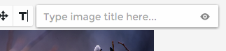
To support the title visibility toggle (eye icon) add this to your stylesheet:
.edy-image-container-with-title:after {
  display: block;
  padding: 5px 0;
  font-size: 0.9em;
  content: attr(data-title);
}