customstyle
Adding {% customstyle %} tag to template triggers usage of Voog Design editor.
{% customstyle %}
  ....
{% endcustomstyle %}
Design editor is an UI extension that allows site editor to change given parameters of CSS like background colour or font.
Implementation
The code between {% customstyle %} tags should be standard CSS syntax using css variable declarations with added "Voogstyle" comments before variable assignments. Variables can currently be only in global scope. Polyfilling browser support is added automatically. The comments contain additional data about how and where the parameter should be displayed in the design editor.
{% customstyle %}
  :root {
    /* VoogStyle
       "path": ["Main Styles"],
       "title": "Bg color",
       "editor": "colorPicker",
       "boundVariables": ["--title-color"]
    */
    --page-color: red;
  }

  body {
      color: var(--page-color);
  }
{% endcustomstyle %}
The syntax in the "/* Voogstyle" comment must be valid JSON syntax, meaning the keys must be escaped in double quotes and comma separated and tailing comma in lists is not allowed.
Parameters
- path Array (required)
- Defines the position in design editor tree structure. Also defines the Titles of the groups. Ex:
["Maingroup title", "Subgroup title", "Tabbed Group"]
- Defines the position in design editor tree structure. Also defines the Titles of the groups. Ex:
- title String (required).
- Title used in the editor of the parameter.
- editor String (required)
- Defines the editor used for changing the value. Currently there are four editor types to choose from: "colorPicker", "listPicker, "rangePicker" and "toggleIcon".
- type String (deafult: "row")
- Every editor has two visual types: "row" (shown as a separate row in editor with title displayed left) and "button" (shown as a compact button without title displayed).
- featured Boolean (default: false)
- If set to true, and editor path is at least level 2, the editor is also displayed after Level 2 heading when group is collapsed.
- boundVariables: Array (not required)
- Defines names of variables that will change synchronously with current variable. The bound variables will change synchronously only when their current value is the same as editor variable value. Thus when user has changed the bound variable value to be different, it will not be overwritten.
Additional editor-specific parameters
rangePicker
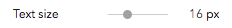
- min Number
- Minimal number value
- max Number
- Maximal number value
- unit String
- Unit used in value (ex: "px")
- step Number (default: 1)
- The step used in range slider.
toggleIcon (toggle on/off button with icon)
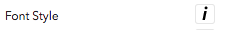
- icon String
- Defines the icon used in button. Allowed values "bold", "italic", "underline" and "uppercase".
- states Object (containing "on" and "off" keys)
- Defines values for on and off states.
"states": {
  "on": "italic",
  "off": "normal"
}
- Defines values for on and off states.
Listpicker
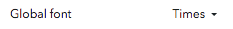
- list Array of objects
- Defines the titles and values in the list:
"list": [
  { "title": "Arial", "value": "Arial, Helvetica, sans-serif" },
  { "title": "Tahoma","value":" Tahoma, Geneva, sans-serif" },
  { "title": "Courier", "value": "\"Courier New\", Courier, monospace" }
] - List can be grouped:
"list": [
{ "type": "group",
    "title": "Serif Fonts",
    "list": [
      { "title": "Georgia", "value": "Georgia, serif" },
      { "title": "Palatino", "value": "\"Palatino Linotype\", \"Book Antiqua\", Palatino, serif" },
      { "title": "Times", "value": "\"Times New Roman\", Times, serif" }
    ]
  },
  { "type": "group",
    "title": "Others",
    "list": [
      { "title": "Arial", "value": "Arial, Helvetica, sans-serif" },
      { "title": "Tahoma","value":" Tahoma, Geneva, sans-serif" }
    ]
  },
  { "title": "Courier", "value": "\"Courier New\", Courier, monospace" }
]
- Defines the titles and values in the list:
colorPicker

Events
- edicy:customstyles:change
- Triggered on document whenever a change is made in design editor. Event.detail.changes contains additional data about the actual changes made.
document.addEventListener('edicy:customstyles:change', function(event) {
  console.log(event.detail.changes);
});
- Triggered on document whenever a change is made in design editor. Event.detail.changes contains additional data about the actual changes made.